The 3 things I include on every Squarespace website I design
Just a quick one for you today, but I wanted to share the three things that I set up for every Squarespace website I design that you should consider too.
Looking at them individually they’re pretty small and some might argue not necessary, but think about all the little things that stand out to you when visiting a website. Things that make you question whether it’s a legitimate website, and things that you can’t quite pick but have made you notice how seamless a site is.
So, what are they?
1. SSL Certificate
What is this? SSL stands for Secure Sockets Layer, which is basically a techy way of saying that it creates an encrypted connection between a website server (for this purpose, think of this as the Squarespace side of the website) and website browser (which is where you view websites, e.g. Google Chrome, Firefox, etc). And what that means? When enabled, it means your website is secure, and guess who loves that… Google! And people that visit your website of course.
This option used to be off by default, however it appears Squarespace has recently changed the default to now automatically enable SSL on new websites.
If you already have a website, you can double check your SSL settings by:
Going to the Settings menu
Click Advanced
Click SSL
Ensure both Secure (Preferred) AND HSTS Secure are checked.
Clive Save
2. Favicon
Heard of a favicon but can’t quite remember what it is? It’s this bit in the corner of your browser tab. It also shows up in your bookmarks menu and if you pin any websites to your browser home page.
Why is it important? If you’re someone that can have anywhere between 10 and 30 tabs open at a given time (🙋♀️), it’s a lifesaver to be able to quickly find what you’re looking for when you can’t see the page titles.
Even for people that are responsible internet users and only keep a management number of tabs open it helps with recognition and contributes to your overall brand identity.
What does it look like if you don’t upload your own favicon? On Squarespace, you’ll get a black cube. Yep, one of the dead giveaways that you’ve DIY’d your site (no shame! But let’s step it up a notch).
If you haven’t worked with a designer on your branding, you may not have an appropriate icon to use for this. If you use your primary logo it will effectively be unreadable when shrunk down to that size (in the browser tabs this is typically 16x16px), but can be larger across other applications. The best favicon is a very simplified version of your logo or an icon - if you don’t have any icons, it can be as simple as your initials in your brand colours.
So, what to do if you don’t already have a favicon design you can use? My friend, you can head straight to https://favicon.io/. You can upload any images here to create the proper sizes that you can upload to your website, or you can use their Text option, where you can add text, choose a font and colours and export the images (or if it makes sense for your brand, you could even use an emoji).
Once you’ve got your icon, you can add to Squarespace like so:
Go to the Design menu
Click Browser Icon
Upload your image
3. Social share image
Have you ever shared your website in a Facebook comment or in Messenger and had some random image (or no image at all!) pulled from your website to accompany the link? That’s called a social share image, and it’s the perfect spot to bring in your branding and help your links stand out.
Sizes recommended for these images may vary depending on who you ask, however Facebook itself requires images to be at least 200px x 200px. While I would recommend using a larger image so it keeps its quality should it be shared in a larger size, you may still wish to use a square image so the design won’t be cropped. Alternative if using a landscape image, which is the preferred format for general Facebook posts, try not to add text near the edges where it’s likely to be cropped.
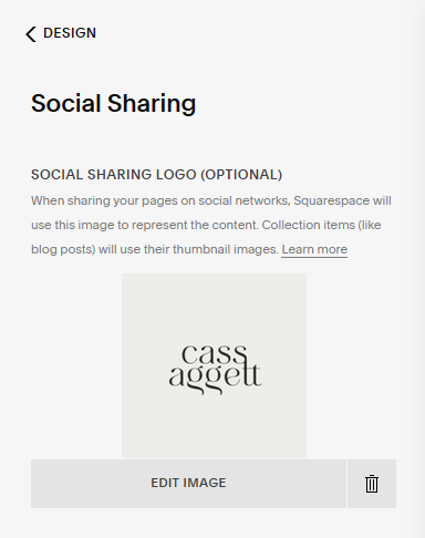
To add a social sharing image for your website:
Go to the Design menu
Click Social Sharing
Upload your image
You can also set alternative images to be shared on certain pages or collections, like a blog or store.
To add to individual pages:
Go to the Pages menu
Hover over the page you want to update
Click the gear / cog icon
Click to Social Image tab
Upload your image and save
To add to a collection item such as a blog, portfolio, store or events page:
Go to the Pages menu
Hover over the blog, store or events page you want to update
Click the gear / cog icon
Click the Social Image tab
Upload your image and save
To add to an individual blog post, portfolio page or event page:
Go to the Pages menu
Click on the the blog, portfolio or events page you want to update
Hover over the post, event or portfolio you want to update
Click the ellipsis button (three dots … )
Click Settings
Click the Social Image tab
Upload your image and save
To add to an individual product page:
Go to the Pages menu
Click on the store page you want to update
Hover over the product you want to update
Click the ellipsis button (three dots … )
Click Edit
Scroll down to Marketing
Click Social Share
Replace or upload your image - by default it will pull in the product thumbnail
While individually these seem like pretty small details, overall they help to increase your brand awareness and increase trust in your website. Who can say no to that?
Have you already got these on your website?


